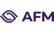
The AFM has a new logo
In recent years, the AFM’s corporate identity has evolved to meet modern requirements. The final element of this evolution is a new logo that we will be using as of today.
The rationale behind the new logo is that as a regulator, in addition to monitoring the financial markets, we also work with them to build sustainable prosperity in the Netherlands. This is reflected in the logo, with lines moving inwards from the outside intended to symbolise our ongoing dialogue with the industry. They also signify our watchful eye, alert to risks and ready to enforce where necessary.
The typography is robust, angular in nature yet smoothly finished, reflecting the AFM’s autonomy while also indicating its nature as a linking pin. The logo has retained its familiar purple hue.
The change was necessary because the old corporate identity and logo were developed 14 years ago and no longer met current requirements for typography and digital accessibility.
Contact for this article

Would you like to receive the latest news from AFM?
Subscribe to our newsletter, we will keep you up-to-date.